Here comes our biggest assignment, or we called it as the masterpiece in our entire POD subject.
Our objective is to create a huge object with different hue and make it float on the lake, which was quite challenging to us when we first heard about this.
At first, we drew some rough sketches for our topic and discuss with Ms Lisa. My group members are Nabila, Dzauqi, Nicholas, Moo and myself. Our original ideas consist of a large and colourful human foot,a big wide opened mouth with different colour teeth, 8 octopus's tentacles and also a submarine which break through the ice caps in the north pole.
At first, we decided to choose the octopus's tentacles because it looks more spectacular and scarier, which really correspond to our personalities. Ms Lisa agreed with our proposal and we will start to make a small demo model.
Doing a real model was actually way harder than just planning. We have no idea how to do a bending octopus's tentacle and yet, the size of it should be large enough. Therefore, we switched to plan B, which is the submarine.
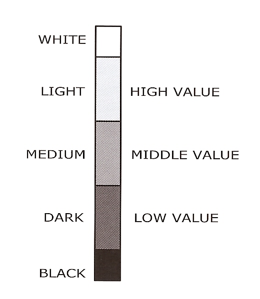
The shape of the submarine is easier than the tentacles but now the problem is the combination of colours. I saw the other groups were applying all the hue in the colour wheel on their subject which seemed kinda childish and too dull actually.
I ain't gonna do that! Is not my style at all, as for my group member as well.
So we doubled confirm with Ms Lisa about the hue combination and she said we don't have to use all the colours for the subject, we just have to apply the best combination of colour based on our knowledge and view of hue.
NOW I SEEEEE......
So, we decided to use the pattern of camouflage on the submarine, makes it looks more army-liked.
We took a sample from google image and is about this~
But we did some modification about the colour, we added some white and black into the whole pattern to increase more contrast.
In the process of construction, we have met a lot of problems and conflict. And sometimes we got no more motivation for the assignment cause is too tiring and our hand and fingers are fulled of wounds.
But still,we make it to the last day and produced a complete creation.
Now let's talk about the method we used to build the entire submarine.
This is the original sketch of the submarine~
As you can see, the body of the submarine is half immersed in the icy water, because it was designed to break through the ice from the bottom of the sea. Therefore the submarine is standing at 45 degree.
STANDING AT 45 DEGREE........That's a real challenge.
Anyway, we built the body if the submarine by using chicken wire and also was my first time using it.
We bent it till it formed the shape that we want then fastened it with the fastener.
The edge of the wire is so sharp that it cuts our finger everytime. But now I recall, why don't we just wear a glove???
After we get the right shape and size, it turned into a huge condom which said by Ms Lisa personally.
Yeah...It does.
So we add some parts for the "condom" to make it not condom! Such as the conning tower and a forward hydropane.
Now, it looks more like a submarine!!!
Then is time for paper mache.
The biggest mistake was we used wheat flour to make the glue....
Because i din't know there's a different between wheat flour and corn flour.
Although the wheat flour glue is very disgusting, but it still works.
Finished pasting the whole body and let it dry for 1 day.
Then the body of submarine became really solid and heavy.
And now is time for colouring.
First we drew the pattern on the body with different colour, then we use paint to colour it.
The process was really enjoyable because the whole hue combination is so comfortable when looking at it. Let me show you the true colours of the submarine~
How is it? awesome?hahaha
And for the ice caps, we used a lot of Styrofoam and spend a lot of money for it...
Now i know that styrofoam is really costly!
We got no choice because we need to make the heavy ass submarine to float on the lake, some sacrifice must be made...
Moreover, we even bought 2 long bamboo stick for extra buoyancy.
So our base was actually a huge size of styrofoam, and beneath it was 4 long bamboo stick.
Hope that it will really float..
As for the ice bergs, we cut some a lot of styrofoam into sharp icy shape and stick it on the base with hot glue gun.
We also attached a torch light on the top of the cunning tower to make it more attractive at night.
Furthermore, we bought a few small light and placed it in between the ice caps. Therefore the ice caps will glow in the night.
Lastly, we planned to put some dry ice on the base.The vapour of dry ice will create some icy effect for our submarine and it looks cool too!
We have worked for the submarine for about one and a half month.
We stayed back everyday in college until around 8pm to catch up the progress.
Finally, we make it to the day of submission.
That's the final looked of our submarine!
Ms Lisa told us that our application for the permission to float our project on the lake has not been proven by the head of department of our college.
It is very unfortunate that we can't float it on the huge lake and witnessed by all the Taylorians.
But we can only float it in the small pond beside the lake...
In order to protect Ms Lisa from getting any penalty from the college, we change our location to the small pond.
Every group gathered their "Babies" to the meet point and carry out a final touch up.
 |
| Our seniors were there to support us~ |
 |
| The colourful train by Desmond's group |
 |
| Nessie the Sea Monster by Kelly's group |
 |
| Merry Go Round by Pui Leng's group |
 |
| A wayside pavilion by Nicoule's group |
The sky turned darker and darker and is about our show time!
Let's take a look at our masterpiece at night~
Time for us to have the final presentation on the lake now.
The hardest thing to put our subject on the pond was the periphery of the pond is full of rough and huge rock!!!
At first we don't have any idea how to carry our subject across the rocks.
But after a few trial and error, we barely lift it up with several people holding it below for support.
Many of us fell on the rock because is very difficult to hold the heavy works and maintain our balance at the same time while crossing the path of rock.
But eventually we made it one by one, and our creation glows brightly in the dark. We felt very satisfied by looking at it. Every effort is worth it at last!
 |
| Floating party!!! |
That's our final outcome for the whole project.
We have learned a lot from the progress such as the importance of teamwork,innovative and consistency.
Also some skills of handwork which is very important for us in the future.
I would like to thank Ms Lisa for giving us such a great opportunity to show our creativity and understanding of colours, also an unforgettable experience for us as well.
In addition, thanks to my group members who really did a good job.
Although sometimes we had some conflict and misunderstanding throughout the process,but is all for the sake of the product,no offence.


.gif)


